Grafana Integration
How to create OEE dashboard for a device
Introduction
This document provides a step-by-step guide for integrating Grafana with your SICON.OS devices for real-time data visualization. By leveraging the power of Grafana, you can transform your device data into more meaningful insights as per your requirements.
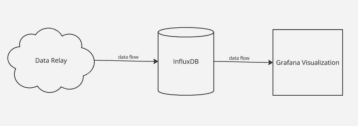
This integration involves three main parts:
Flow diagram:
Follow the instructions carefully to ensure a smooth and efficient setup.
Part 1 : Setting up InfluxDB with your SICON.OS data
Following are the steps to setup the InfluxDB with your SICON.OS data:
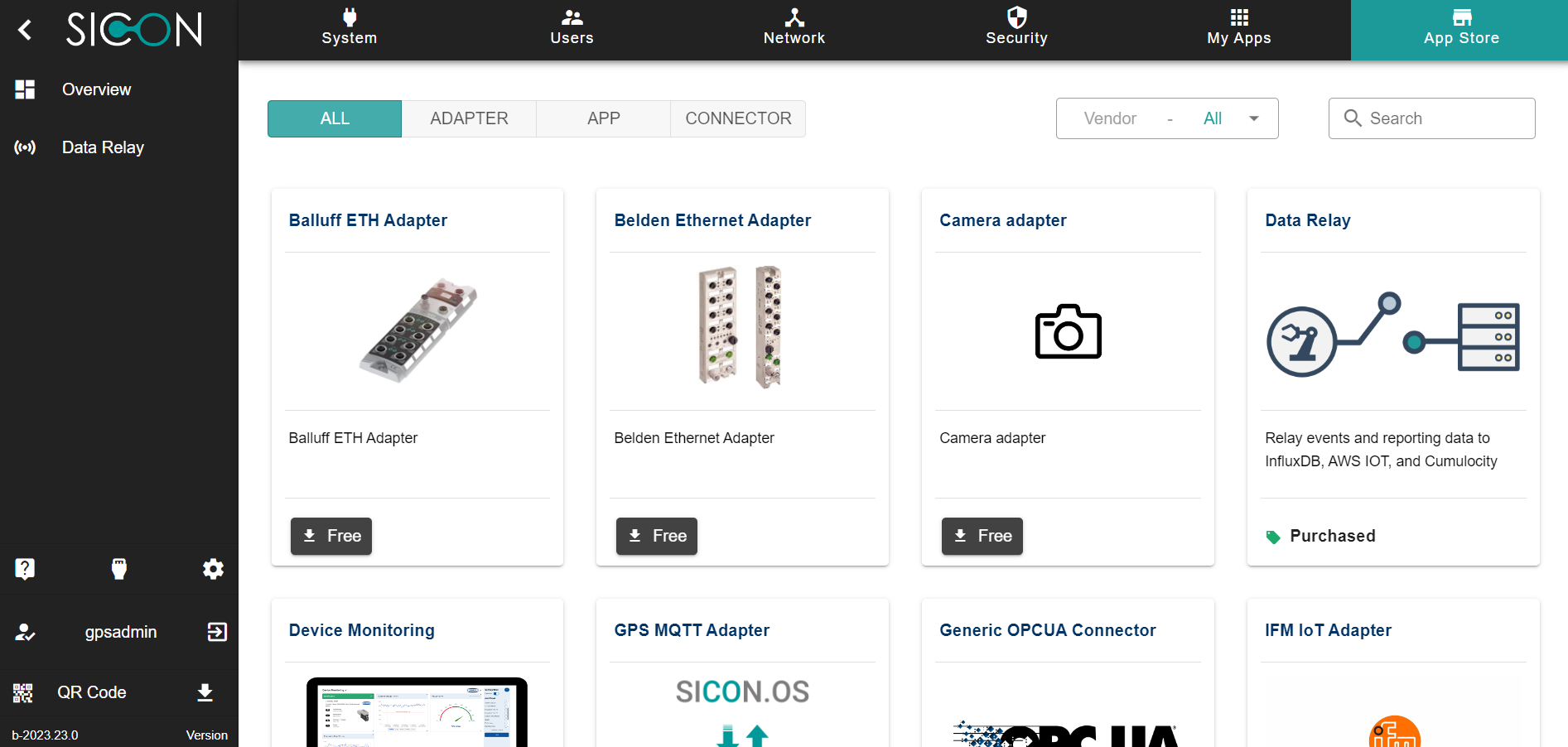
Go to your SICON.OS and navigate to the App Store. Now install the Data Relay App.
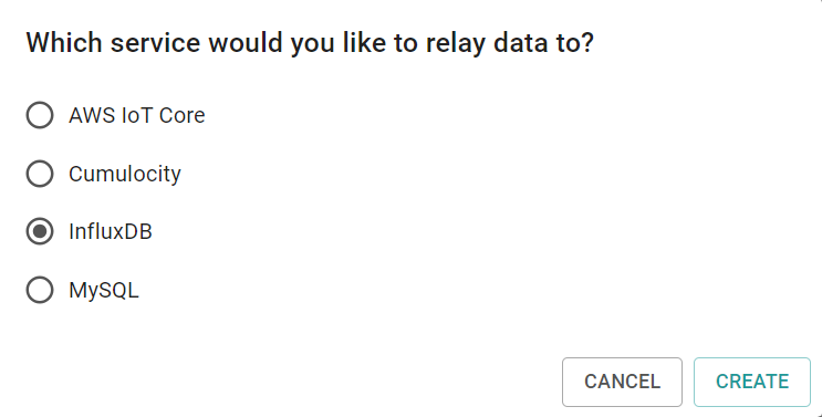
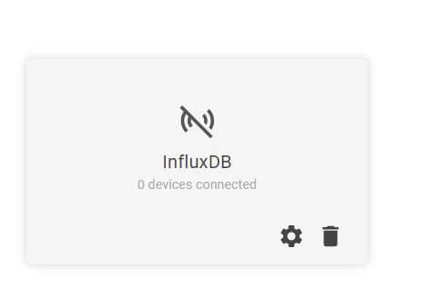
Once the app is installed, navigate to the side panel “Data Relay“ and then click on ADD DATA RELAY
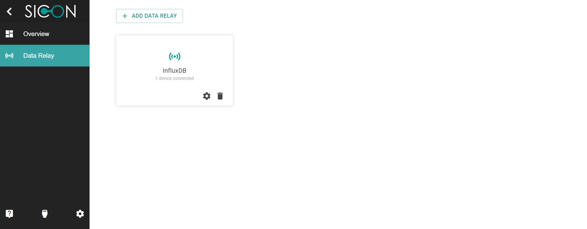
Select InfluxDB and click on CREATE.
4. In order to create a connection with InfluxDB, you will need the following details to fill in:
Endpoint
Bucket Name
API Tokens
Organisation detail
4.1 Endpoint: It will be your InfluxDB URL.
Ensure you have it ready for the configuration.
4.2 Bucket Name: You must create a bucket where data will be pushed to.
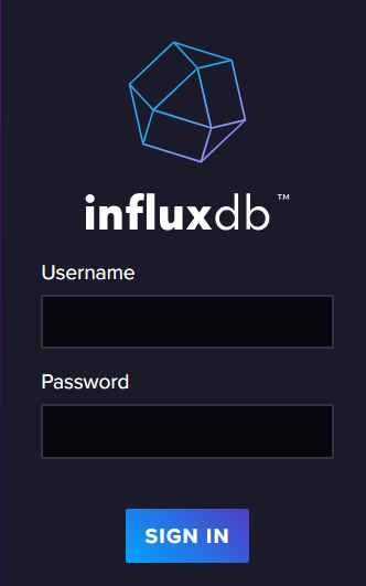
i) Login to the InfluxDB server with your Username and Password.
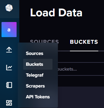
ii) Go to Buckets.
iii) Click on “Create Bucket”
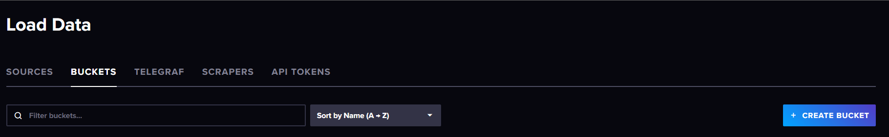
iv) Give the bucket a name and click on “save”. For example - “my.cloud-bucket“
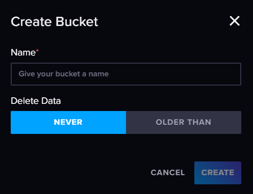
Keep the same bucket name with you for later configuration.
For example - “my.cloud-bucket“ .
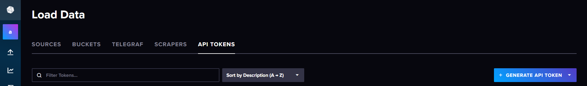
4.3. For API tokens :
i) Go to InfluxDB. Navigate to the Side menu. Click on “API tokens”

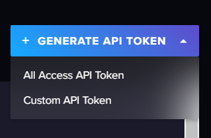
ii) Click on “Generate API token” > “Custom API Token”
iii) Give it a suitable token name in description, select your bucket from the bucket list and tick ☑️ the write checkbox and click on “Generate”.
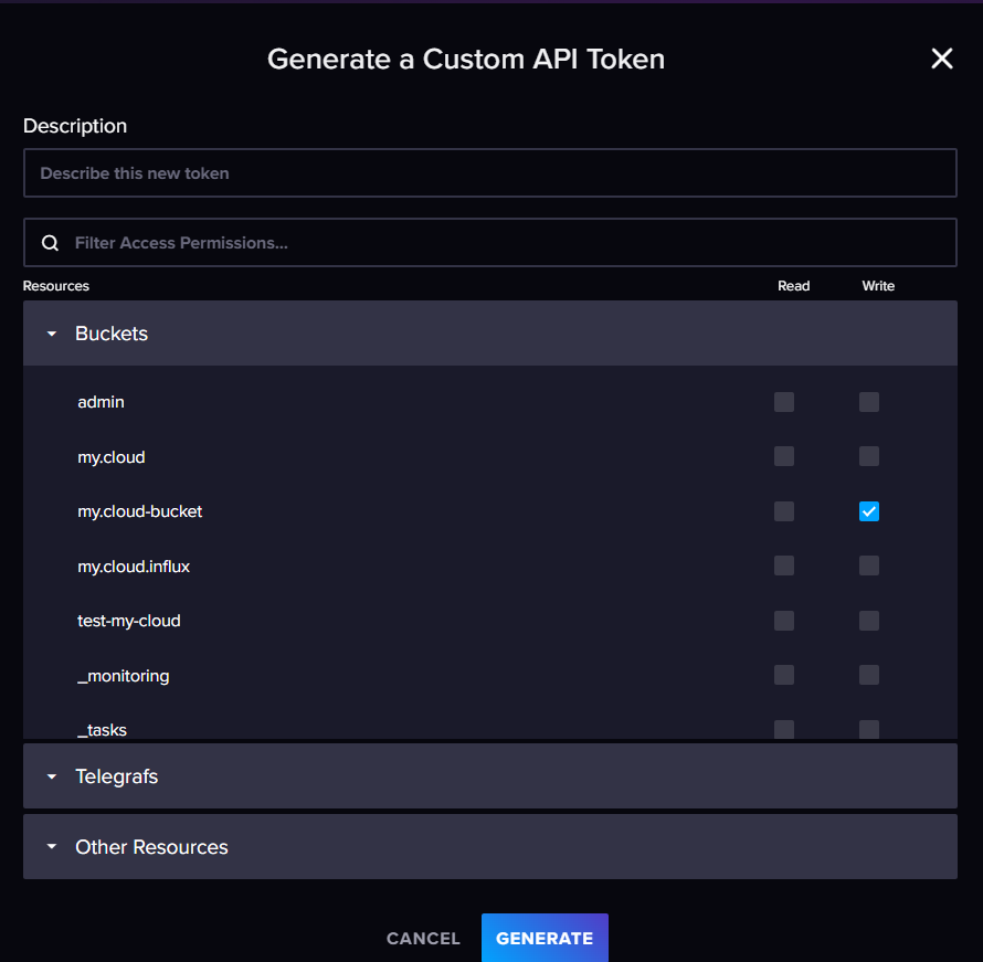
iv) Token will be generated, copy it and store it for configuration later.
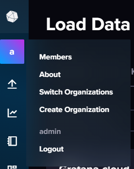
4.4. For Organisation : Check the Organisation by clicking on the left side icon.
For example - here we see the organisation is “admin“. Keep it with you for configuration later.
Now go to your SICON.OS > Data relay > Click on the “setting icon” ⚙️ and go to Settings page and fill the input from the above steps.
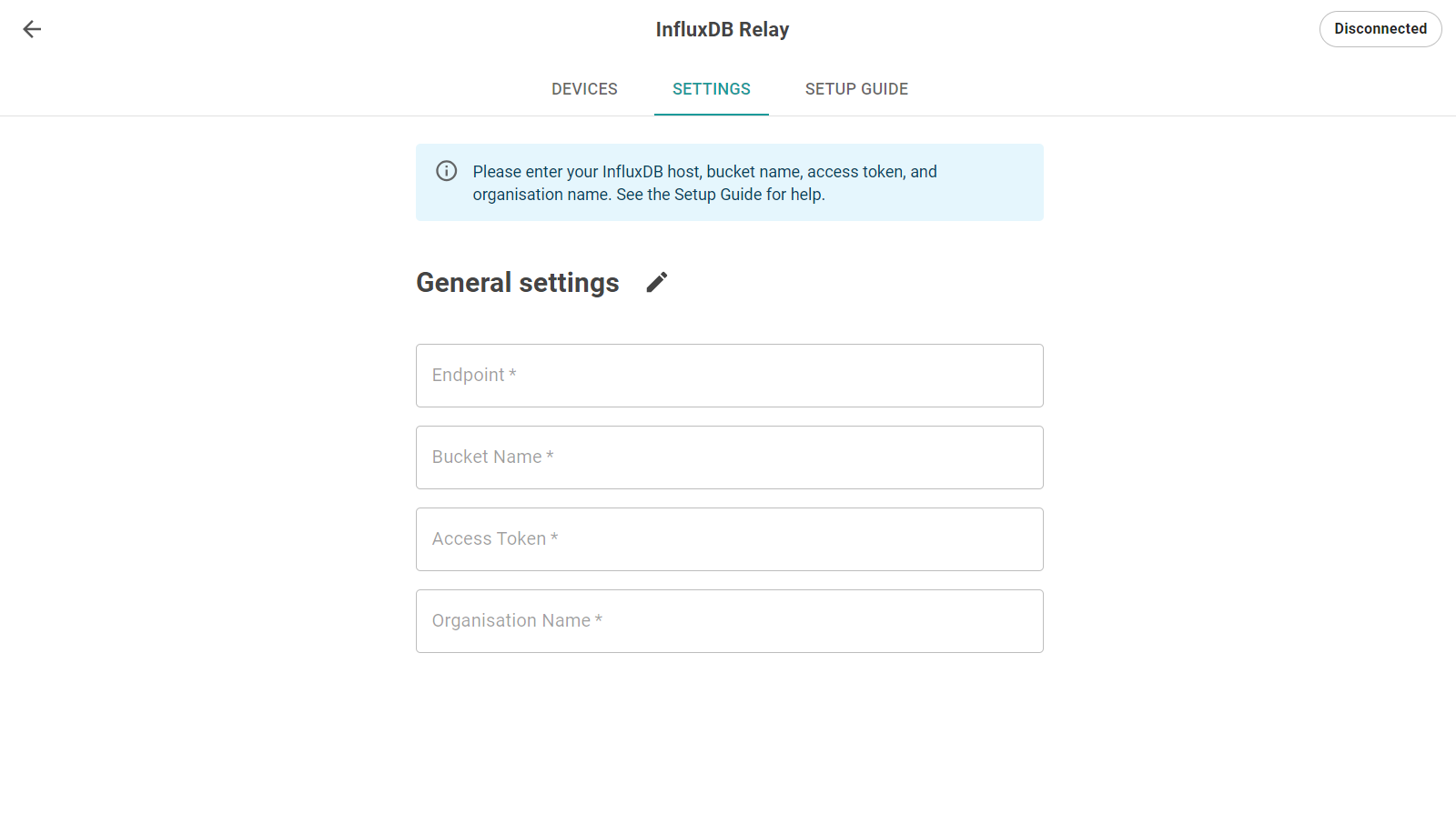
Click SAVE Icon to save the above settings.

[Note: You can create only 1 Data Relay per InfluxDB]
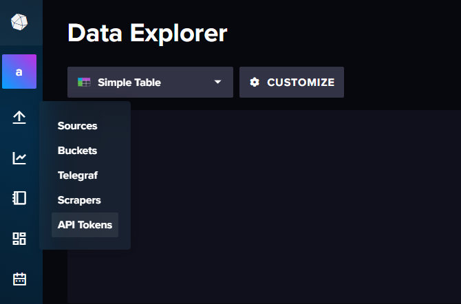
Now go to SICON.OS > data relay > devices and it will show all available devices.
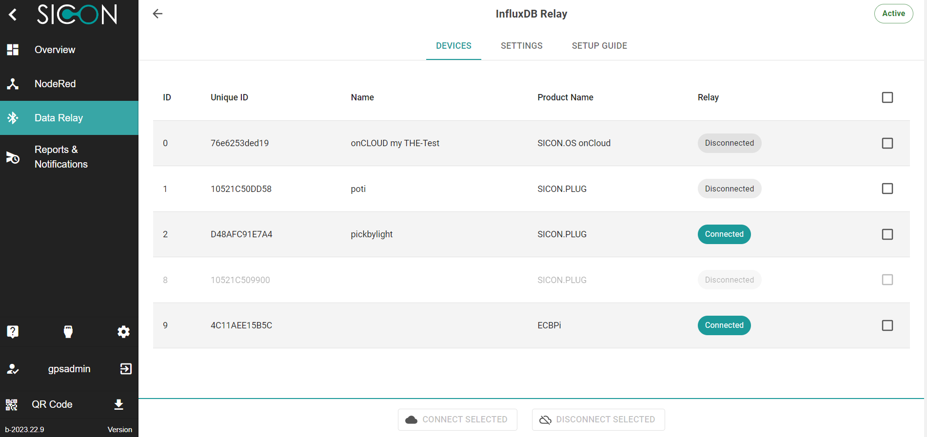
Tick the checkbox ☑️ for the device you want to connect and click on CONNECT SELECTED
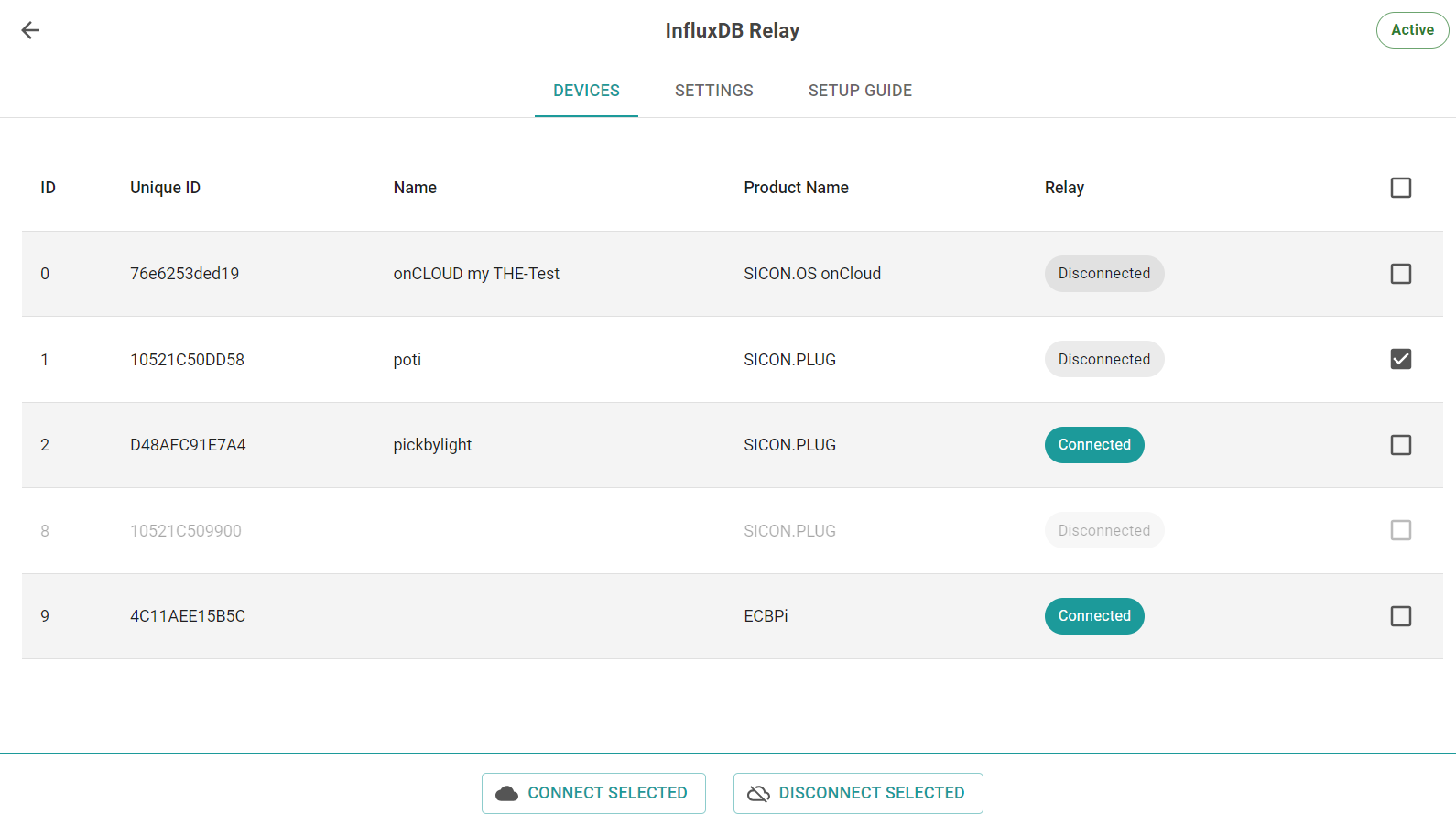
Now, the device should show “Connected“ in Data Relay column.
Verify if the connection was successful by going to InfluxDB Dashboard and click on “buckets”
example: my.cloud-bucket
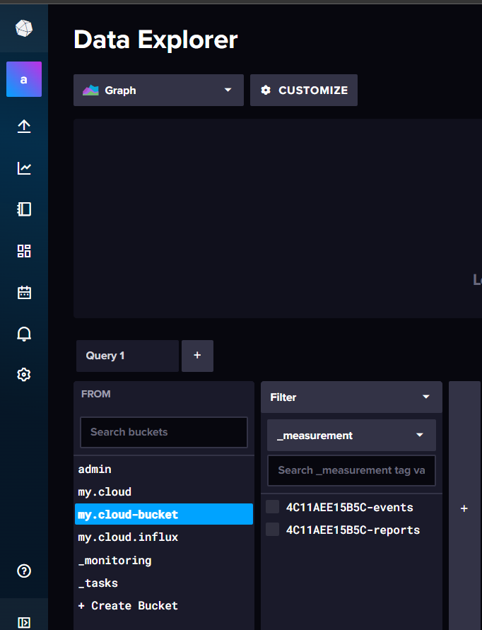
Now you can see the data for example - Reports or Events in our case.
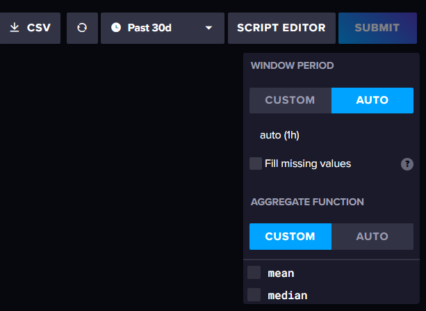
Select custom and untick the mean option.
Note:- On bottom right side, we have aggregation function activated by default which should be modified to custom and untick mean (if it was selected previously).
On top right side, you can select “Simple Table“ from the dropdown options of visualization and click “submit” and now you see the data values.
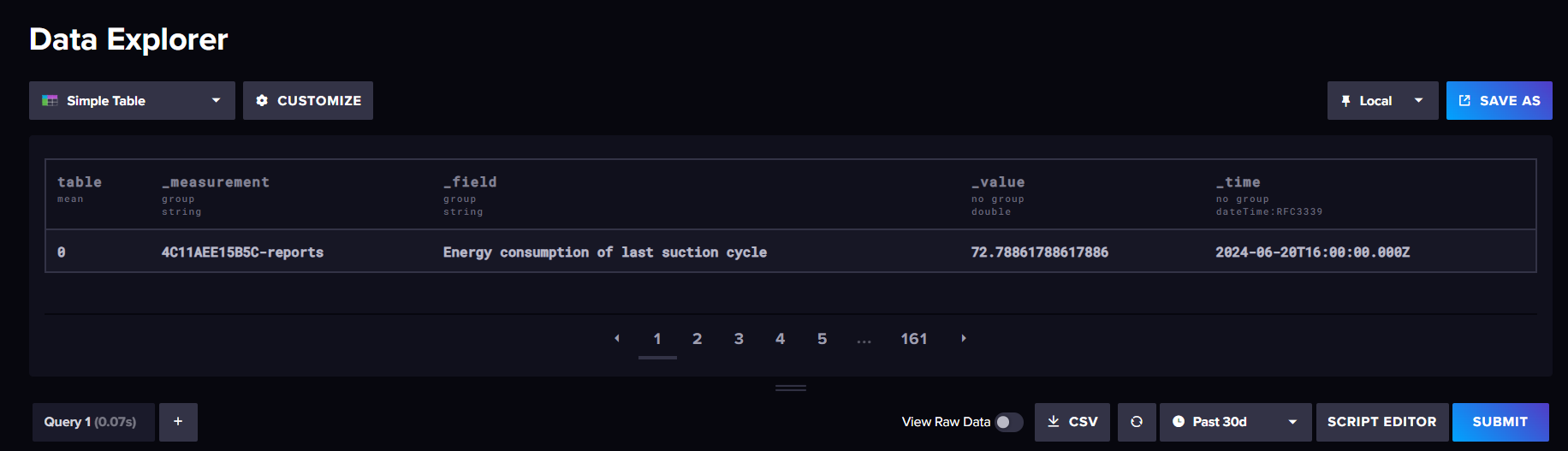
If we see data in the above step, it means our connection was successful. ✅
Part 2: Setting up Grafana with InfluxDB and Visualization
Login to “Grafana”.

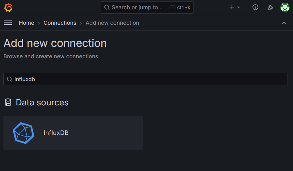
Go to Connections > Add new connection
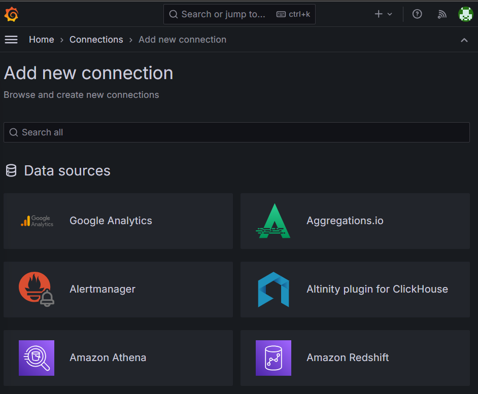
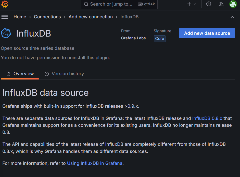
Search for “InfluxDB”.
Click on “Add new data source“
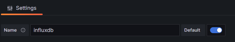
Give a suitable name for InfluxDB connection.
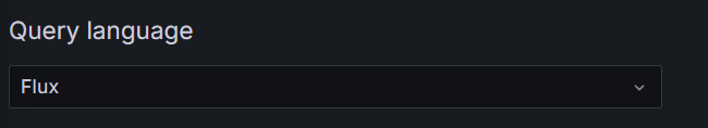
In Query Language, select “Flux” from the dropdown list.
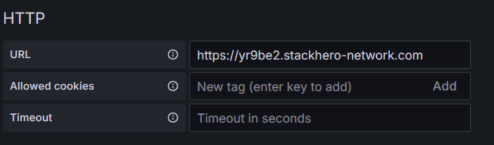
Enter the InfluxDB URL -
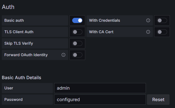
In Auth, select “Basic auth” and enter the username and password for InfluxDB.
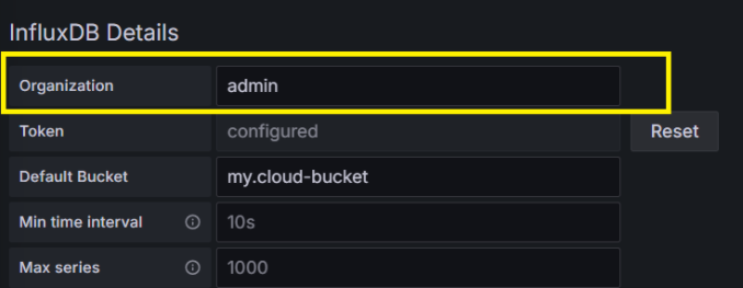
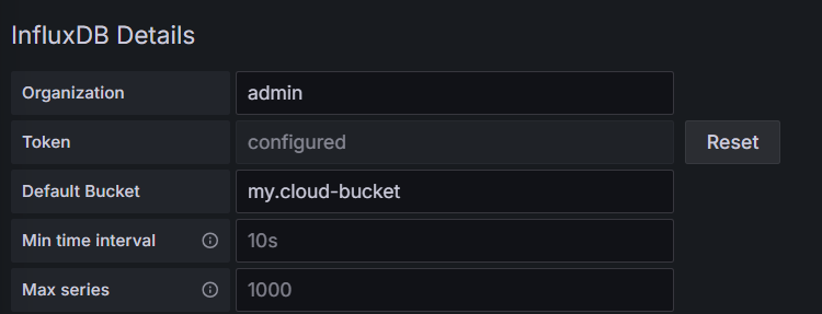
In InfluxDB details -
Organisation - Use this Organisation name same as we used in Part 1 - Step 4.
Token -
Go to InfluxDB > API Tokens > Generate new token.
Click on “All Access API Token” and give it a suitable name, copy it and “save” it.
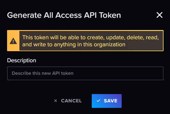
iii. Paste it in the token field in the configuration.
Click on Save and Test. It should show connection successful. ✅

Now, we are ready to create visualizations on Grafana
=====================================================================
Part 3: Grafana visualization by creating different panels
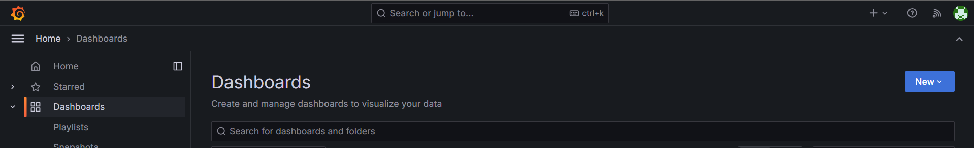
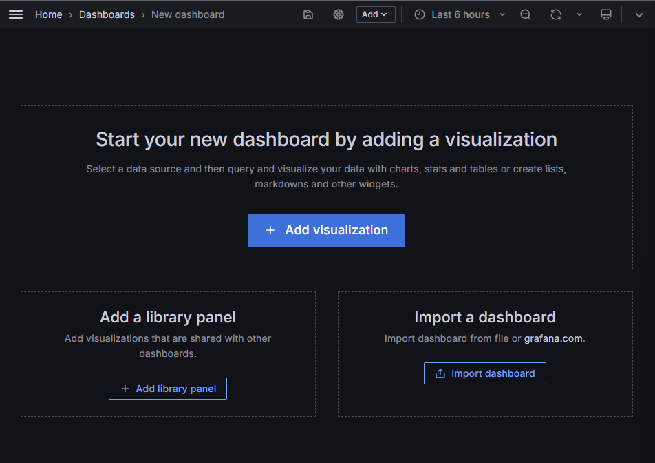
Go to Dashboard and click new Dashboard
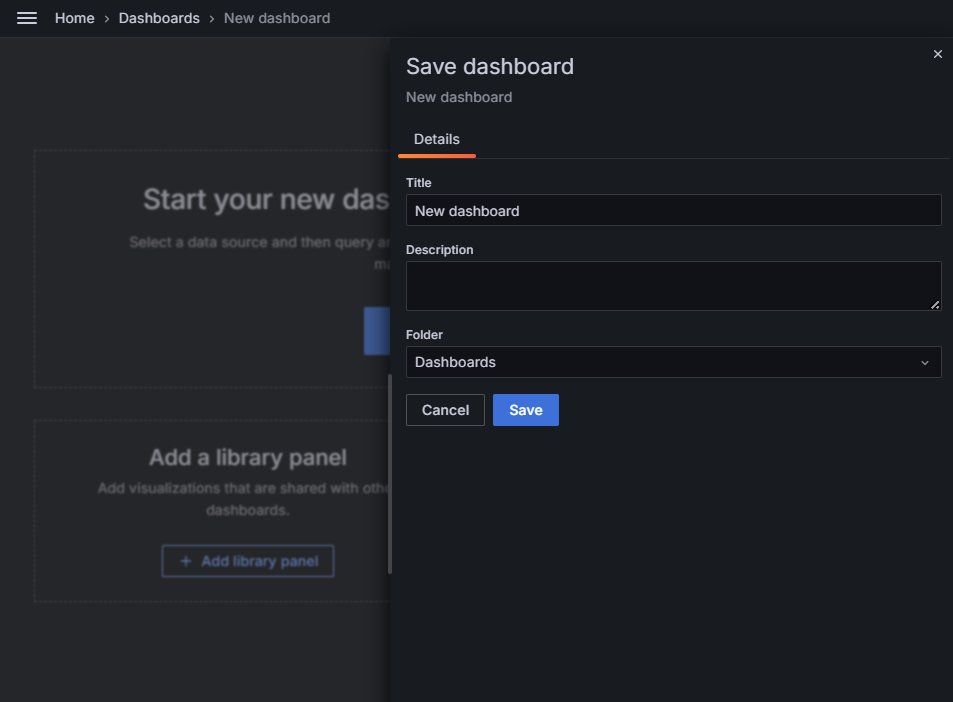
Click on save icon on top and give it a suitable name and click on save
We will see two examples on how to create visualization on Grafana.
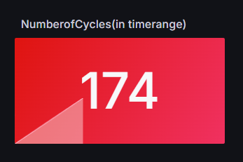
Example 1 - Number of cycles
i) Go to InfluxDB, and click on “Buckets”, select the bucket you have created and then select the data for Visualization with the help of checkbox
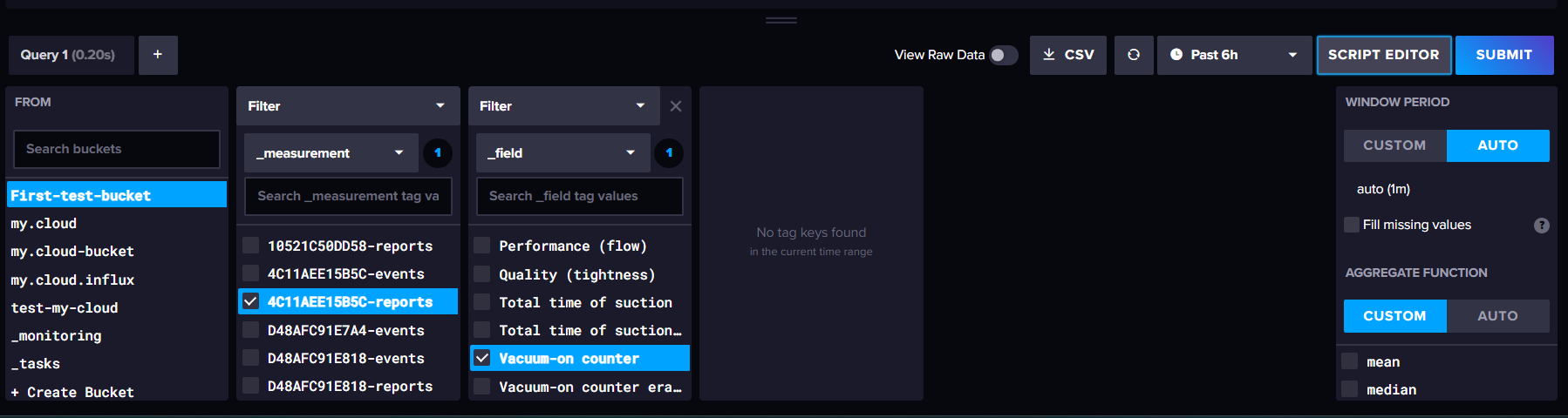
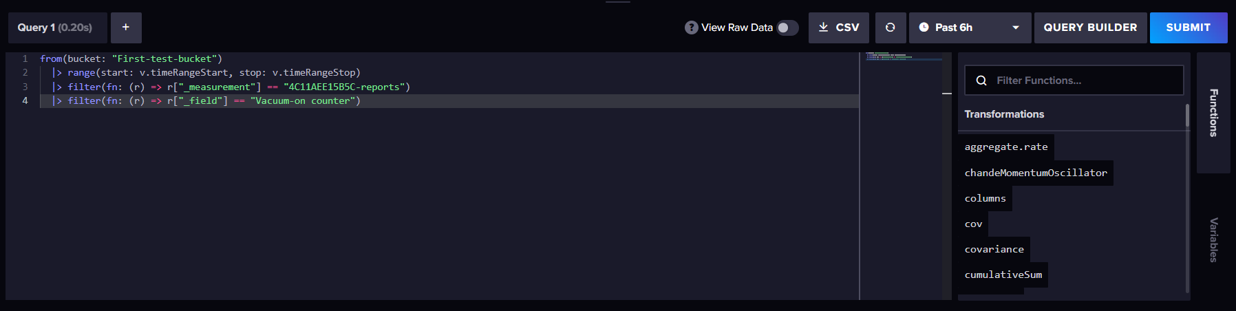
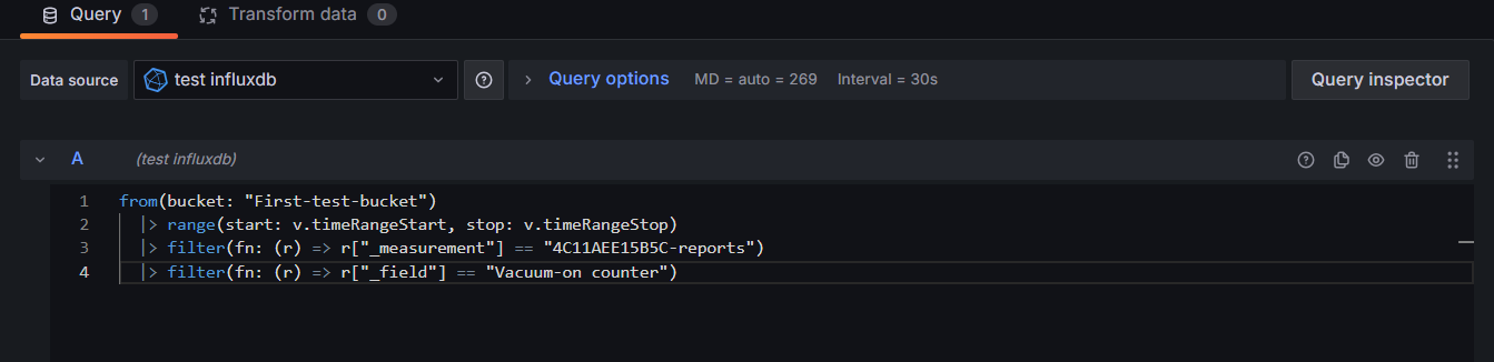
ii) Click on Script Editor and copy the query
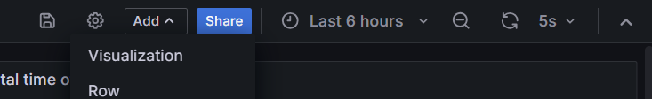
iii) Go to Grafana Dashboard and on top you will find “Add“ dropdown and then select Visualization.
iv) Paste the query
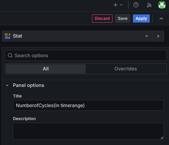
v) On top right, choose the type of visualization you want - (Table, Stat, Gauge, etc)
(For example - choose Stat to show the number of cycles)
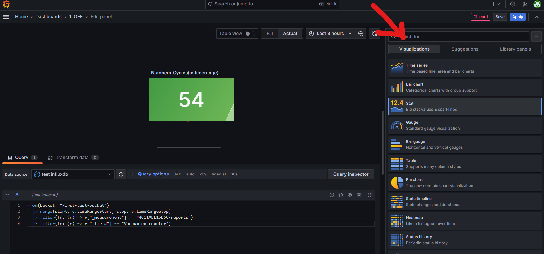
vi) Give it a suitable name and save it
Example 2 - Running Time visualization
i) Go to Grafana Dashboard and on top you will find “Add“ dropdown and then select Visulaization.
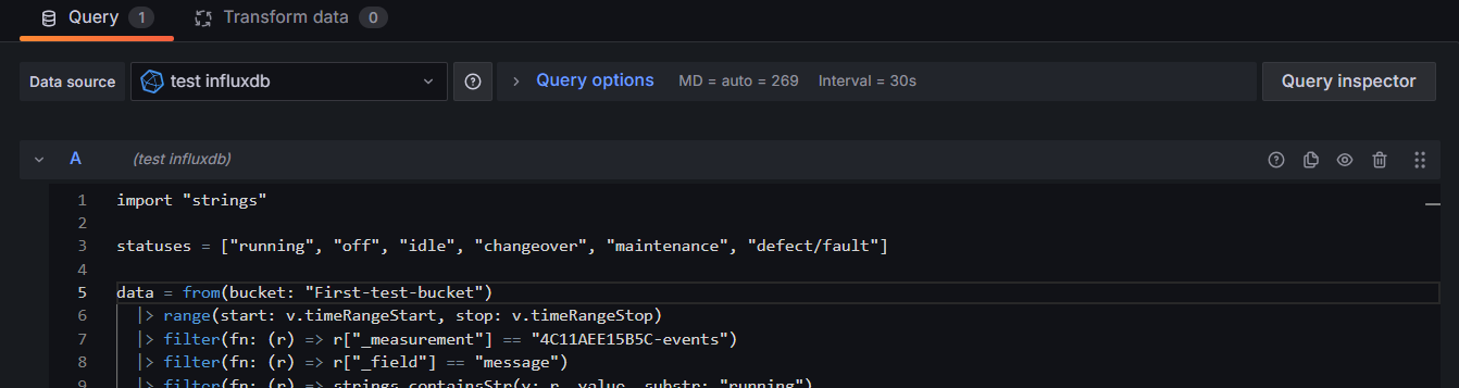
ii) In the query section, paste the below flux query
Remember to change the bucket name in the query below -
import "strings"

statuses = ["running", "off", "idle", "changeover", "maintenance", "defect/fault"]

data = from(bucket: "bucket.my.cloud")
  |> range(start: v.timeRangeStart, stop: v.timeRangeStop)
  |> filter(fn: (r) => r["_measurement"] == "4C11AEE15B5C-events")
  |> drop(columns: ["code"])
  |> filter(fn: (r) => r["_field"] == "message")
  |> filter(fn: (r) => strings.containsStr(v: r._value, substr: "running")
      or strings.containsStr(v: r._value, substr: "off")
      or strings.containsStr(v: r._value, substr: "idle")
      or strings.containsStr(v: r._value, substr: "changeover")
      or strings.containsStr(v: r._value, substr: "maintenance")
      or strings.containsStr(v: r._value, substr: "defect/fault"))
  |> map(fn: (r) => ({r with _status: if strings.containsStr(v: r._value, substr: "running") then "running"
                        else if strings.containsStr(v: r._value, substr: "off") then "off"
                        else if strings.containsStr(v: r._value, substr: "idle") then "idle"
                        else if strings.containsStr(v: r._value, substr: "changeover") then "changeover"
                        else if strings.containsStr(v: r._value, substr: "maintenance") then "maintenance"
                        else "defect/fault"}))
  |> sort(columns: ["_time"])
  |> elapsed(unit: 1s, timeColumn: "_time")
  |> group(columns: ["_status"])
  |> sum(column: "elapsed")
  |> map(fn: (r) => ({r with total_duration_seconds: r.elapsed}))
  |> drop(columns: ["elapsed"])

data
  |> pivot(rowKey:[], columnKey:["_status"], valueColumn: "total_duration_seconds")
  |> map(fn: (r) => ({
      running: if exists r.running then r.running else 0,
      off: if exists r.off then r.off else 0,
      idle: if exists r.idle then r.idle else 0,
      changeover: if exists r.changeover then r.changeover else 0,
      maintenance: if exists r.maintenance then r.maintenance else 0,
      defect_fault: if exists r.defect_fault then r.defect_fault else 0
  }))
and it looks like this -
iii) Select the Gauge visualization for this from the right side
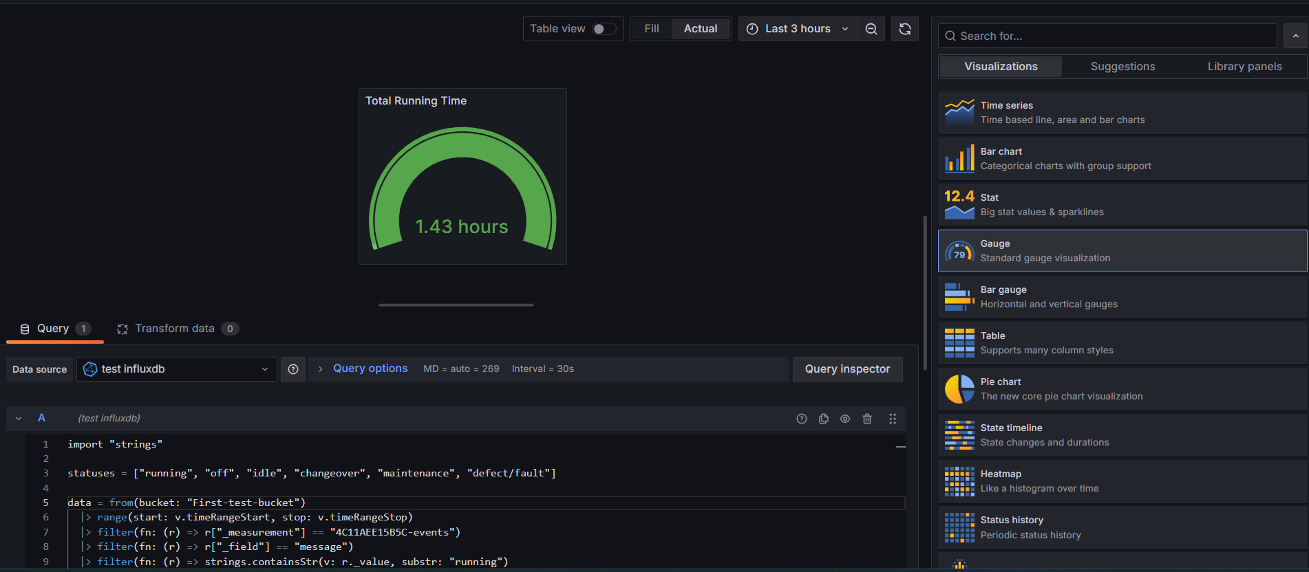
iv) Scroll down to “Standard options” and then “in the unit dropdown menu - select the appropriate unit
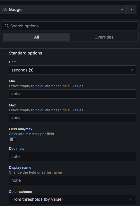
And as this query is returning multiple values -
Total time of ["running", "off", "idle", "changeover", "maintenance", "defect/fault"]
We can select the time we want to visualize. Here we need to select running time.
v) In the right side option, scroll down to Value Options
In the field section, select - running
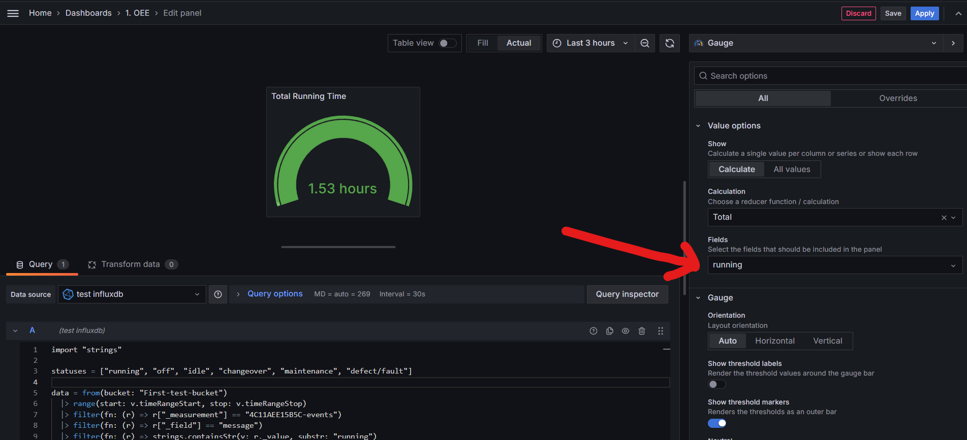
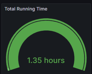
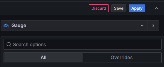
vi) Now, you are getting the total running time of the device. Click on Save
And the output will look like this -
===============================================================
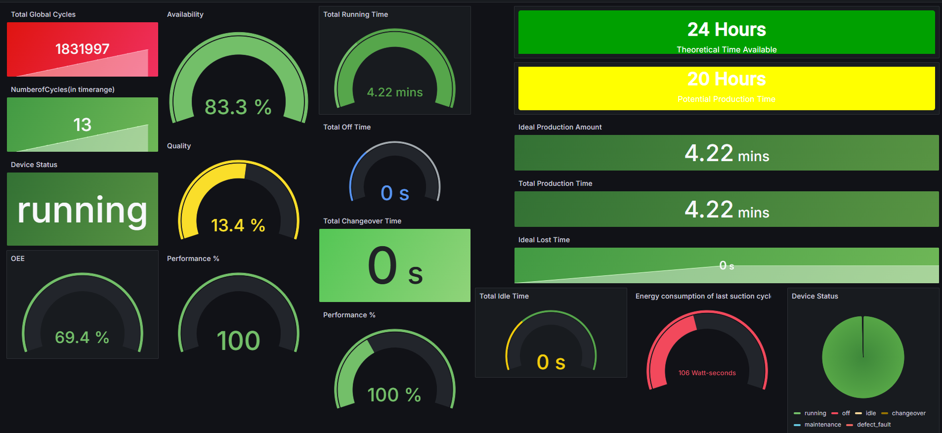
Similarly, other panels for visualization can be added in a similar way and after adding all the visualization you want - the complete dashboard will look like this -